November 23 2020
Tags:
Share:
Welcome to the first in our three-part series on Accessible Design. At Door 22, we carry out design work for charities and organisations that rely on awareness and fundraising to be able to improve the lives of the people they support.
For that exact reason, we want to make our designs as accessible and appealing to as many people as possible, including beneficiaries, supporters, funders. This series will cover three main areas – colours, fonts and layout. So, first up, we are going to look at how to make colours accessible, especially those with colour blindness.
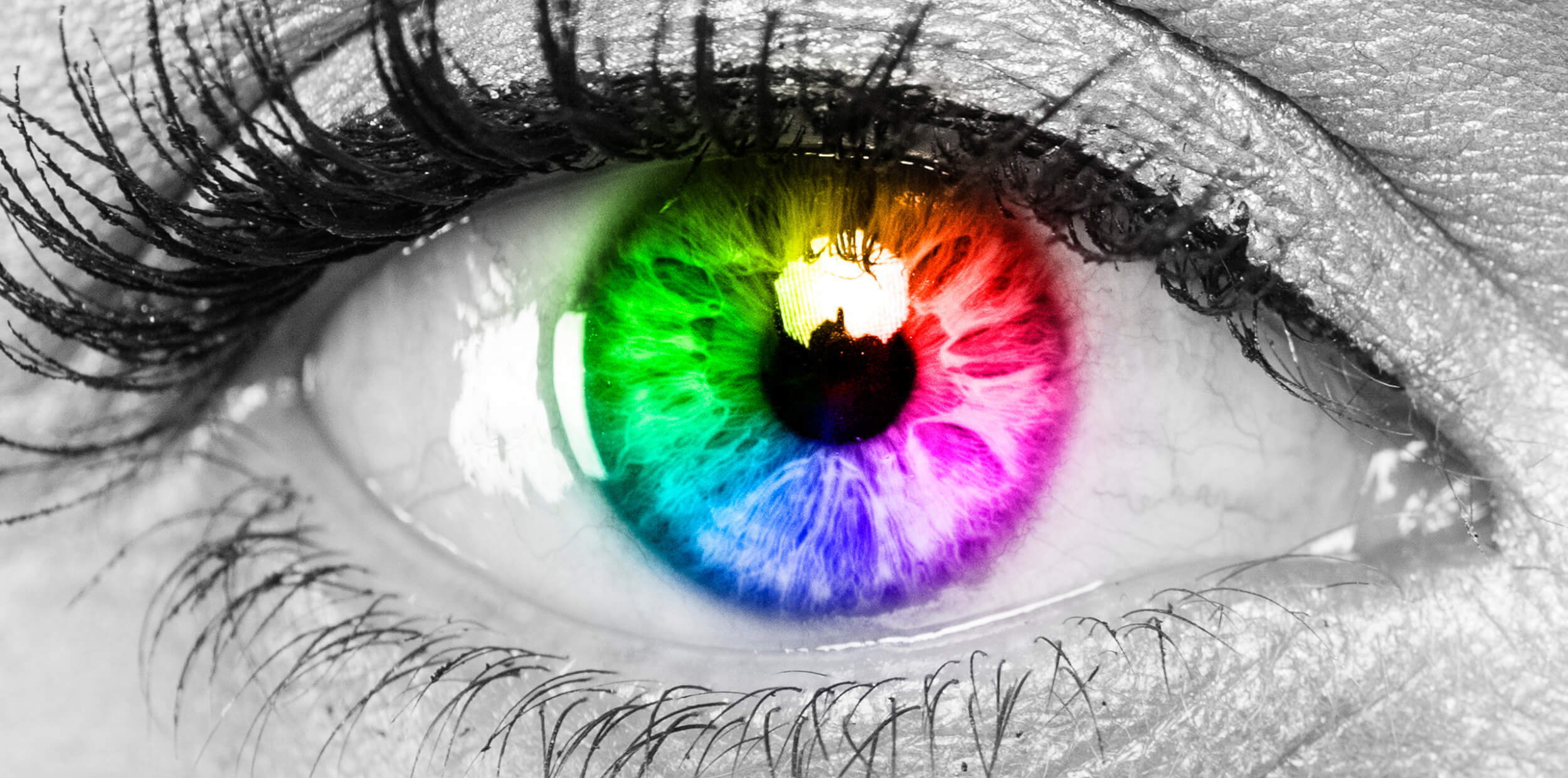
What colours can you see?
Take a look around you. What colours can you see? Think about how many different colours there are, their tone, their shade. Now imagine that someone else will see that same view totally differently. And this applies to websites and marketing material too. But just how different are the ways that people access and experience colours?
This is a topic that is close to our Creative Director’s heart. Emma’s partner is colour blind, so she is mindful of it in her everyday life, and consequently in her role as a designer. She finds colour accessibility a fascinating, much-debated concept that continues to surprise people and, ultimately, deepen understanding.
The medical term for colour blindness is Colour Vision Deficiency (CVD) and it means that people find it difficult to identify and distinguish between certain colours. Approximately 8% of men and 0.5% of women in the world have CVD. That’s nearly 10% of the world population! And around half of these experience moderate to severe effects. Many with milder symptoms are often unaware there’s an issue and research suggests that about 80% of colour blind children enter secondary school undiagnosed.
There are different types of CVD which result in varying degrees of symptoms. Take a look at these images from the Royal National Institute of Blind People (RNIB) website:

This is how people with a full range of colours view different colours.
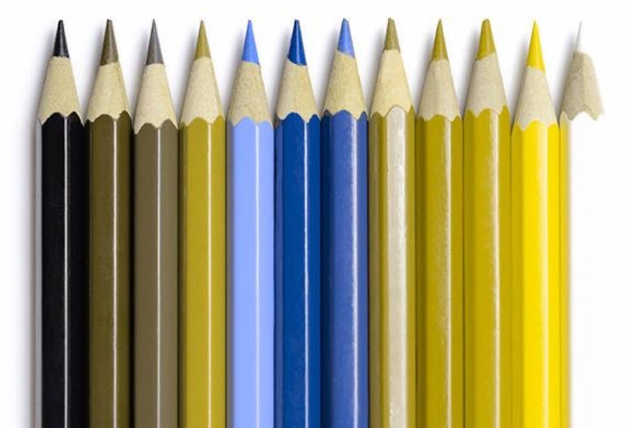
Deuteranopia and protanopia are the most common forms of CVD, where people have trouble distinguishing red, orange, brown and green.

Tritanopia is much rarer, where people see blue as green and yellow as violet, light pink or grey.

Achromatopsia is extremely rare but means that people experience everything in black, white and shades of grey.
These stats and images show that there is a significant need for designers to consider colour accessibility in their work. So, as a design agency, how do we approach this?
How to make colours accessible
When designing websites, or indeed any marketing materials, there are a number of principles we take into consideration so we can make colours accessible to as many people in the target audience as possible:
- Don’t use colour as the only visual way of describing information. Make sure you have a symbol, pattern, letter or word to accompany it.
Compare these two examples:
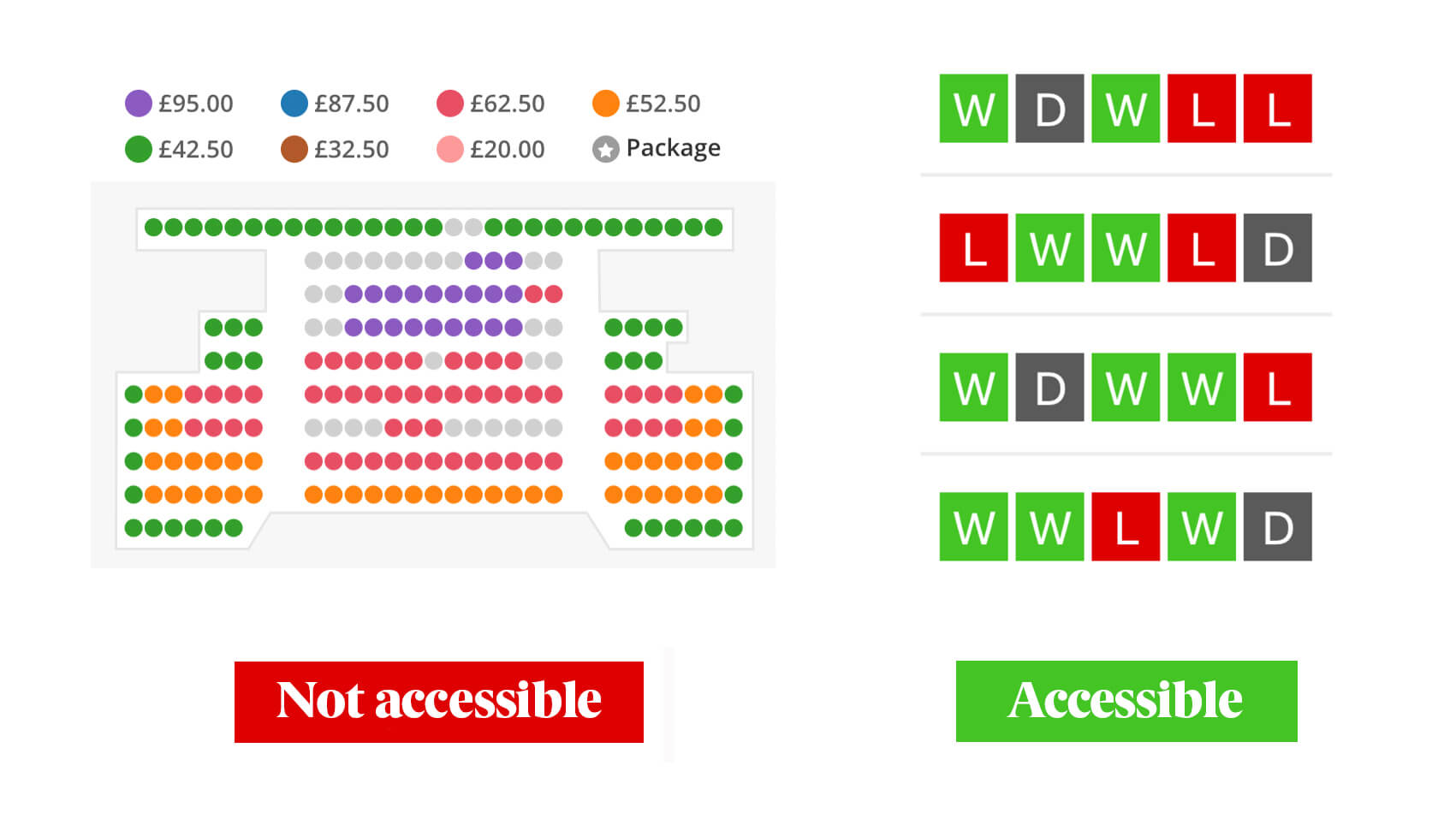
The ATG ticketing site (like many other ticketing websites) uses a colour-only model to show availability and pricing, which is completely inaccessible for people with certain forms of CVD.
On the right is the BBC football results table – the use of letters along with colours avoids what could be an anxious moment for a football supporter with CVD.
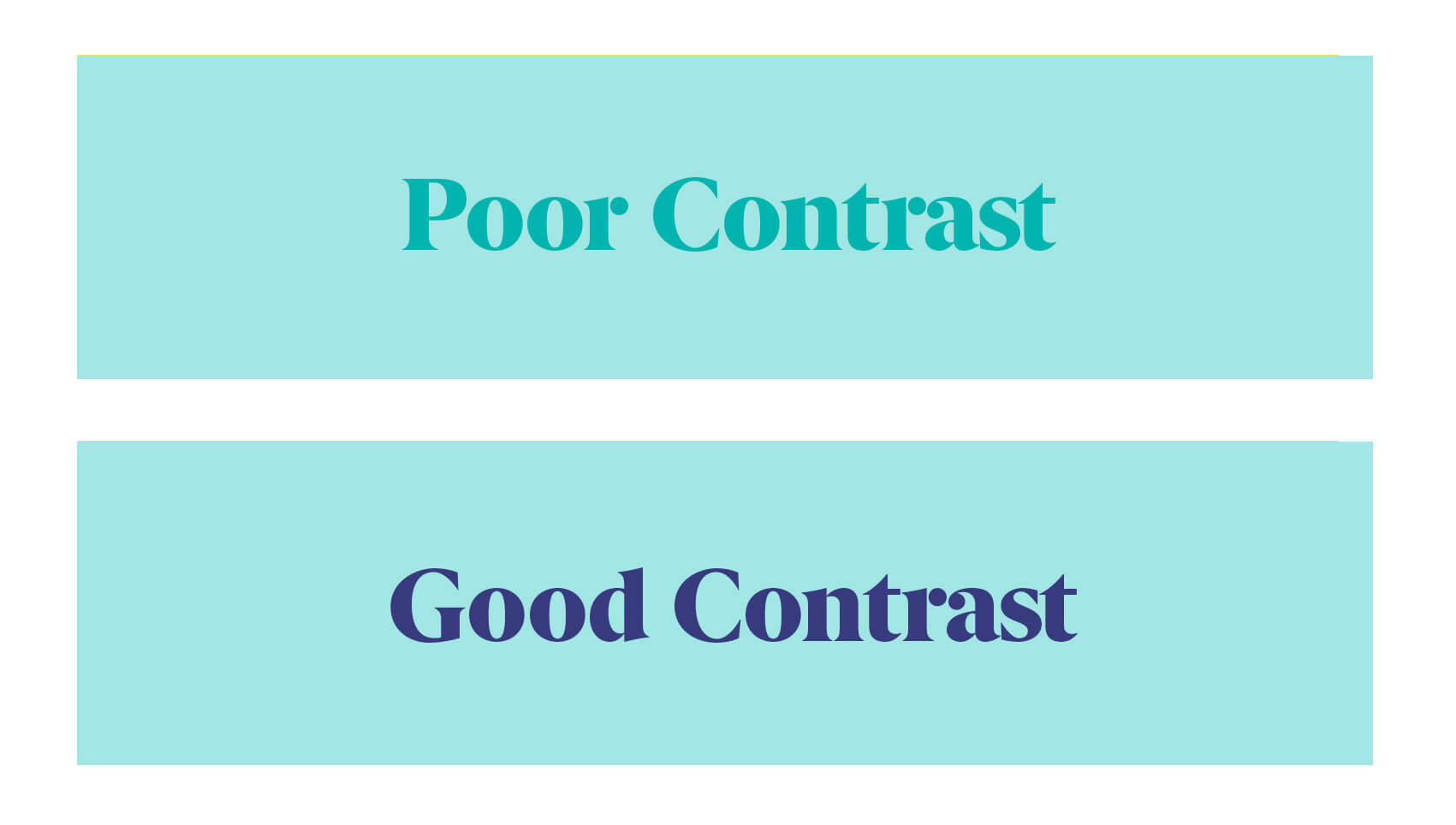
- Use a good level of contrast between colours. A general rule on colour contrast is that there should be at least 70% difference in the colour value between text and background tone.
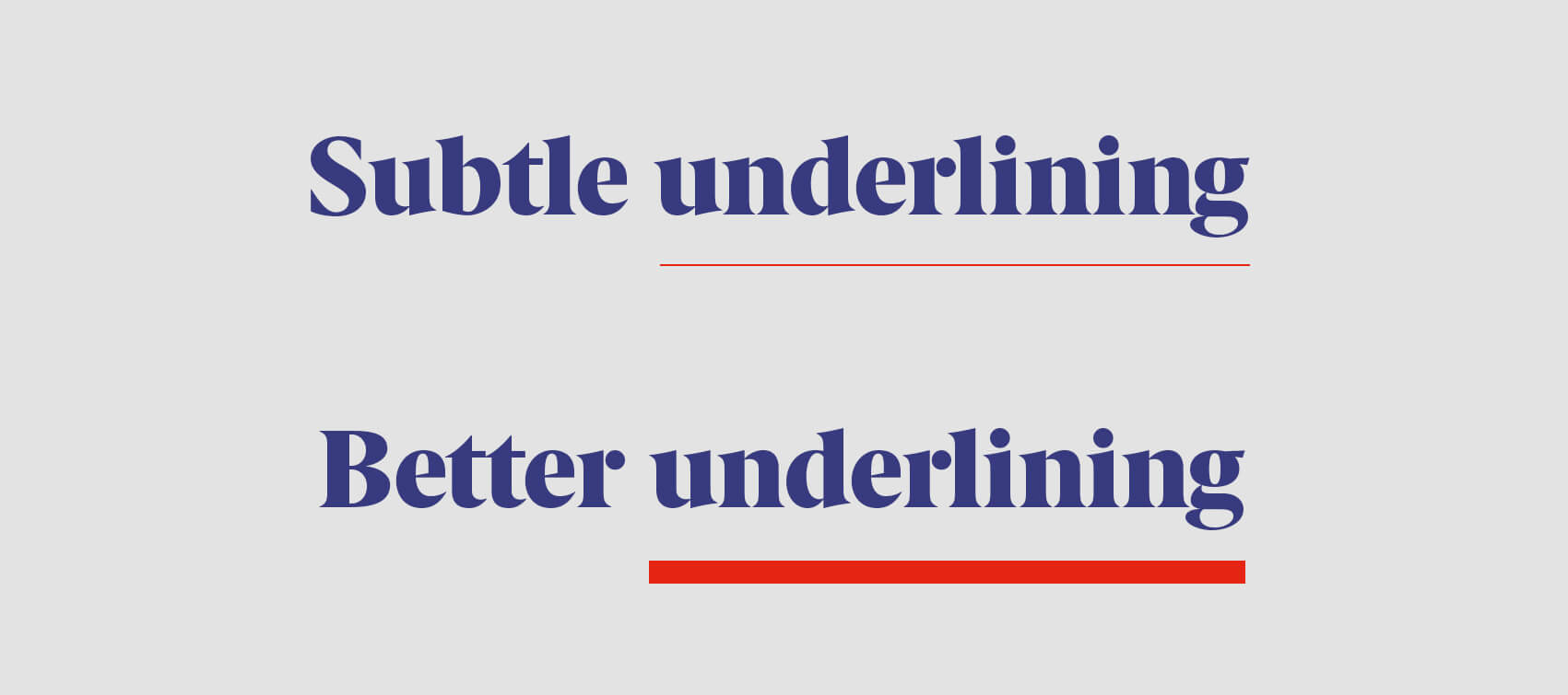
- Don’t be too subtle. If using coloured lines, make them thicker. People with milder degrees of CVD can see colour as long as there’s enough of it.
Top colour accessibility tools
There are lots of excellent tools to help make sure online designs are as accessible as possible in terms of colour. While there aren’t as many for printed designs, the practices are largely transferable. Below are a few of our favourite resources and tools.
- Web Content Accessibility Guidelines (WCAG). This is a great place to start for website design as it covers a range of recommendations, including colour criteria standards.
- Stark. This is an excellent colour simulator with a free version that allows you to see the main three types of CVD. It integrates with Adobe XD as well as other software.
- Who can use. This is an amazing tool that allows you to see the colour contrast, ratio, and WCAG compliance, as well as the percentage of the population who can access the design according to their type of CVD. It also provides a simulation, which is shown in direct sunlight and night-time modes.
- Tanaguru contrast finder. This tool not only checks the colour contrast of a design, but also helps you choose a new colour if the contrast isn’t ideal.
- Accessible colour palette builder. This provides a nice way to build up an accessible palette, checking up to six colours and how text contrasts.
This is by no means a definitive list, but it gives you our main go-to tools here at Door 22.
Colour accessibility doesn’t only apply to colour blindness
A final point for this colour edition of our Accessible Design series is that there are other audiences that require consideration in the use of colour, aside from people with CVD – the first two being dyslexic and autistic audiences.
The British Dyslexia Association provides a really useful guide, which explains that the one of the main things to bear in mind is background colour. Consider alternatives to white backgrounds for both online and offline use. White can appear too bright, so a soft tone like a pastel colour or cream would be preferable.
When considering colour for people on the autistic spectrum, it’s important to use simple colours and not bright contrasting colours that are distracting and too visually noisy.
Finally, awareness of cultural connotation, meaning and symbolism should always be considered when thinking about colour accessibility. It’s always worth researching and getting to know the intended audience before selecting colourways. For example, the colour red is associated with happiness and prosperity in China but symbolises mourning in South Africa. ‘The Meaning of Colors in Cultures Around the World’ provides a nice insight into how symbology and colour can mean very different things from culture to culture.
So, as you can see, there’s a lot more to consider when choosing colours than just what ‘looks nice’. Colour accessibility can be a challenge, but having an understanding of what it is and how to approach it in design leads to providing a more inclusive experience for everyone. Our role as a design agency is to give all of the aspects in this blog full attention when working on a design so we can make colours accessible to as many people as possible. And, let’s face it, by making something easier to read and digest, you’ll get far more engagement from your target audience.
If you’d like to know more about how we make colours accessible, then just drop us a line. We’d love to chat.