The challenge
In 2019, we developed Freedom from Torture’s bold new brand identity – a visual system designed to support their advocacy, campaigning and life-changing therapeutic work with torture survivors. Six years on, it was time to refine elements of the brand and supporting design systems to support both brand usage feedback and evolution of the organisation.
The original headline font had become more common across the sector. The restricted secondary colour palette, whilst distinctive, needed refinement to allow more flexibility. And most importantly, Freedom from Torture needed to address a fundamental challenge around photography and survivor representation.
Our approach
This wasn’t about starting from scratch. It was about refining and evolving a brand that was working well, addressing specific pain points while strengthening what already worked.
We began with desk research into the competitor landscape – both brand positioning and social media presence. This helped us understand how Freedom from Torture could stand out visually while maintaining their distinctive voice.
Typography evolution
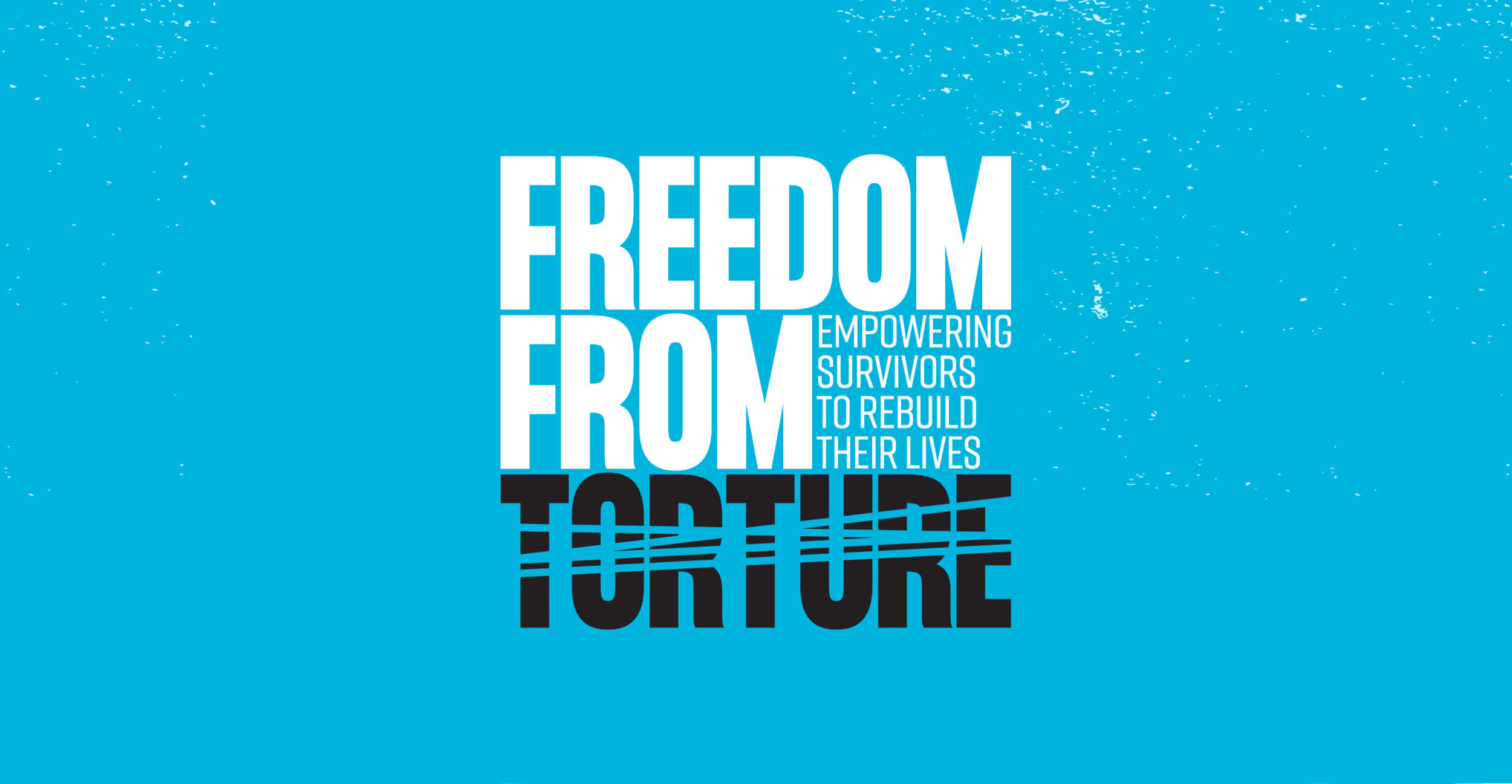
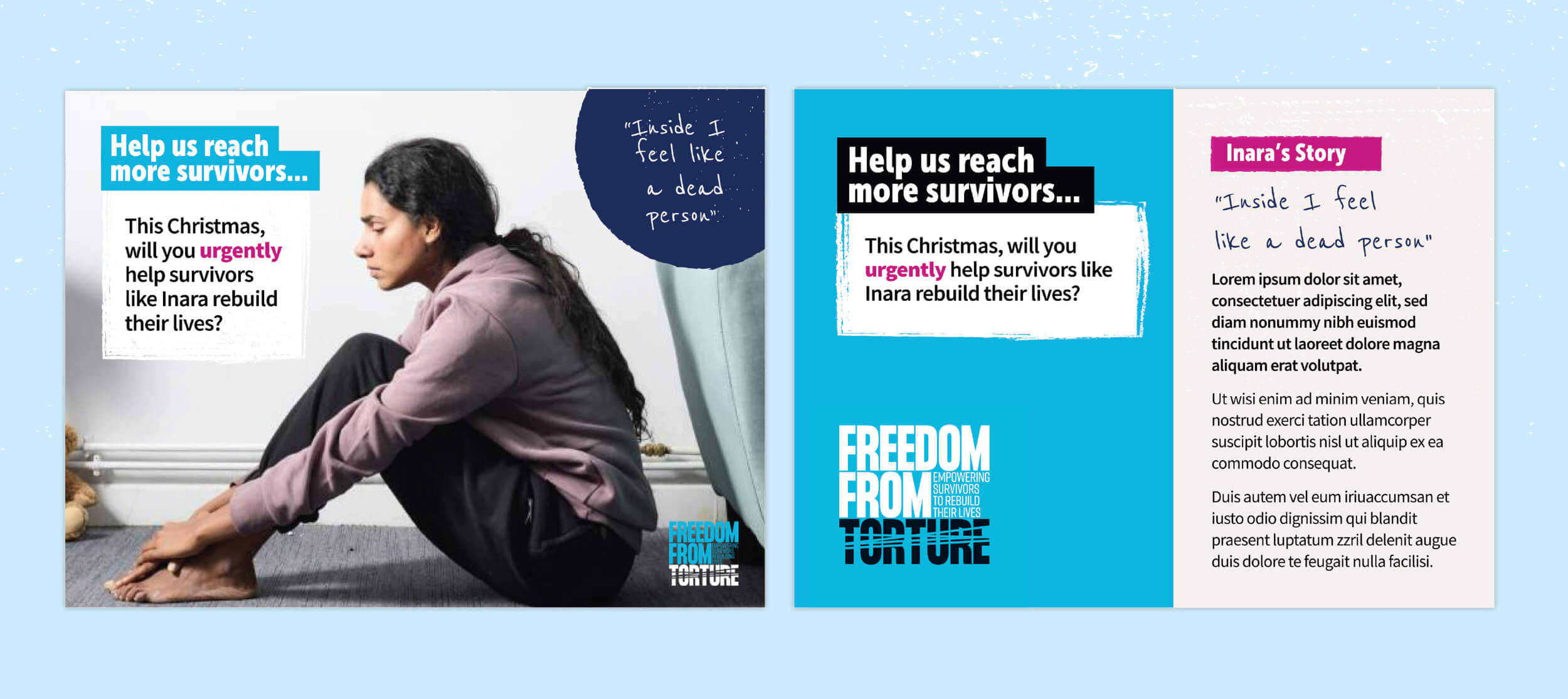
Their headline font was a strong and bold choice, particularly with advocacy and campaigning in mind. It allowed strong messaging and powerful statements to be visually arresting, demanding attention and prompt action. It has some quirky letters within its range, and feedback revealed that this had caused some challenges and caution in implementation.
The new headline font maintains strength for advocacy messaging whilst softening the personality and providing greater versatility.
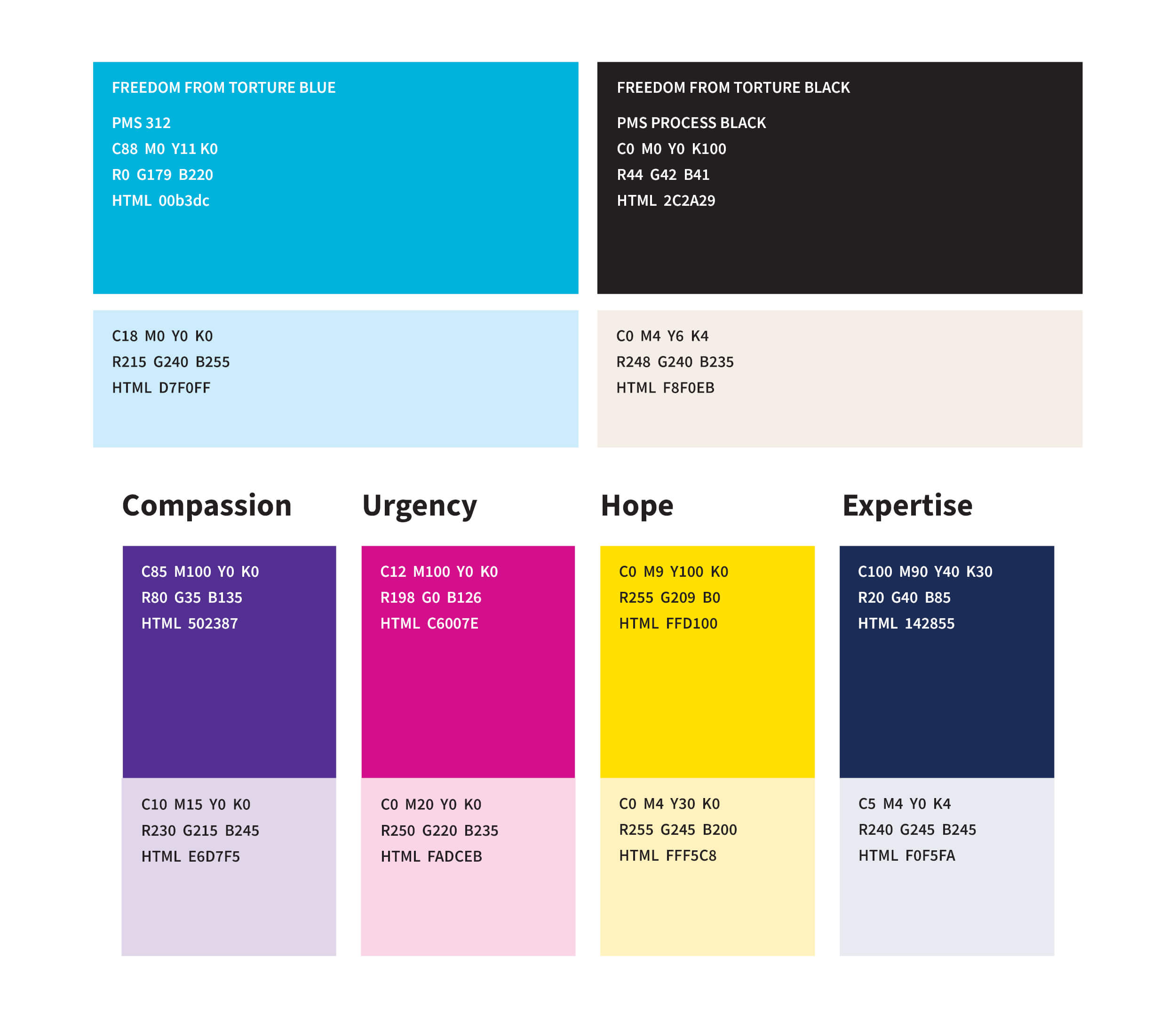
Expanded colour palette and textures
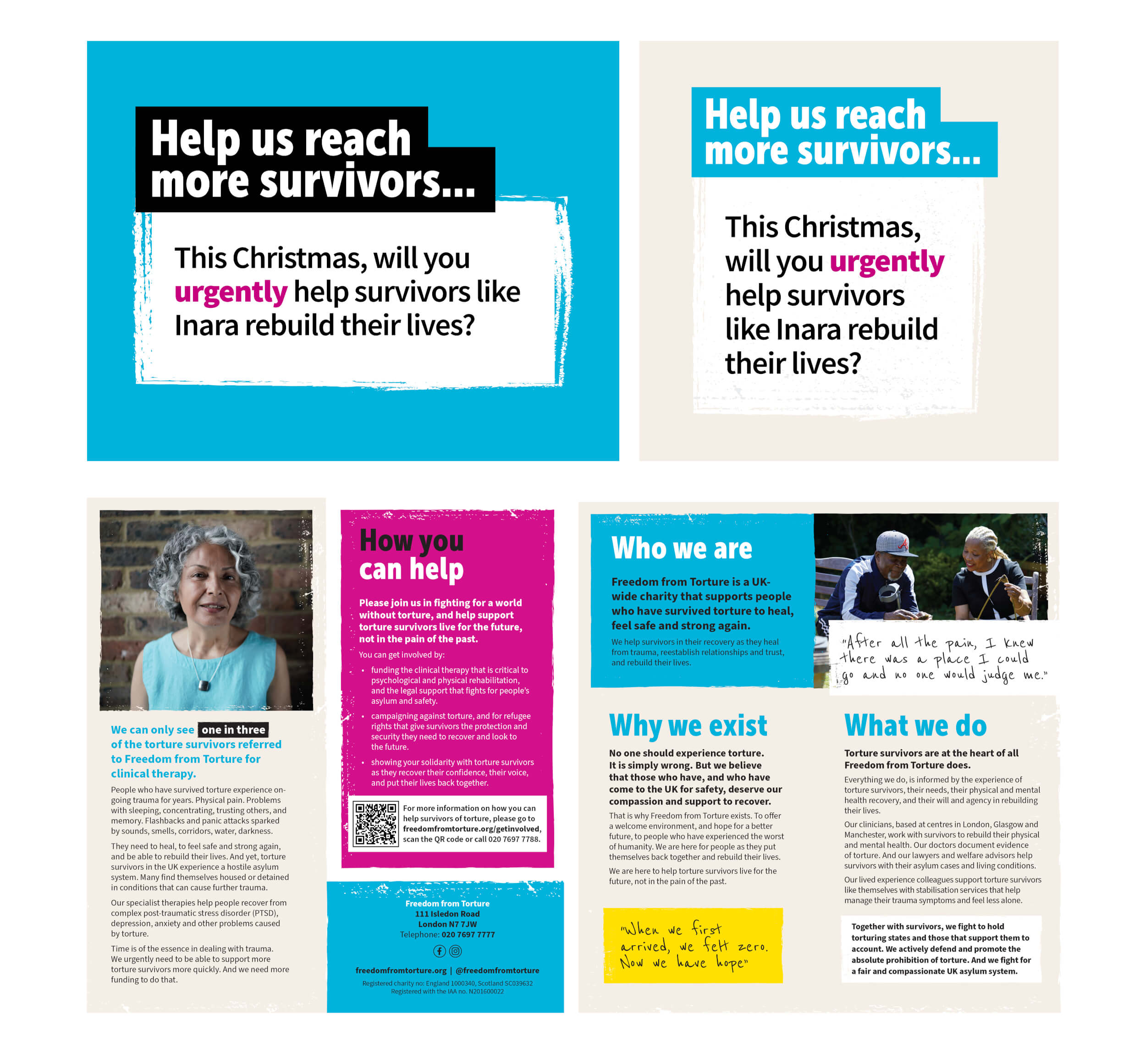
The original secondary palette was intentionally restricted to create a distinct brand personality, confidence and brand recognition. For the refresh, we developed a wider range that gives fundraising and communications teams more breathing room. The expanded palette includes compassionate, supportive tones whilst retaining the brand’s bold character. We built in detailed brand guidance around its use and implementation.
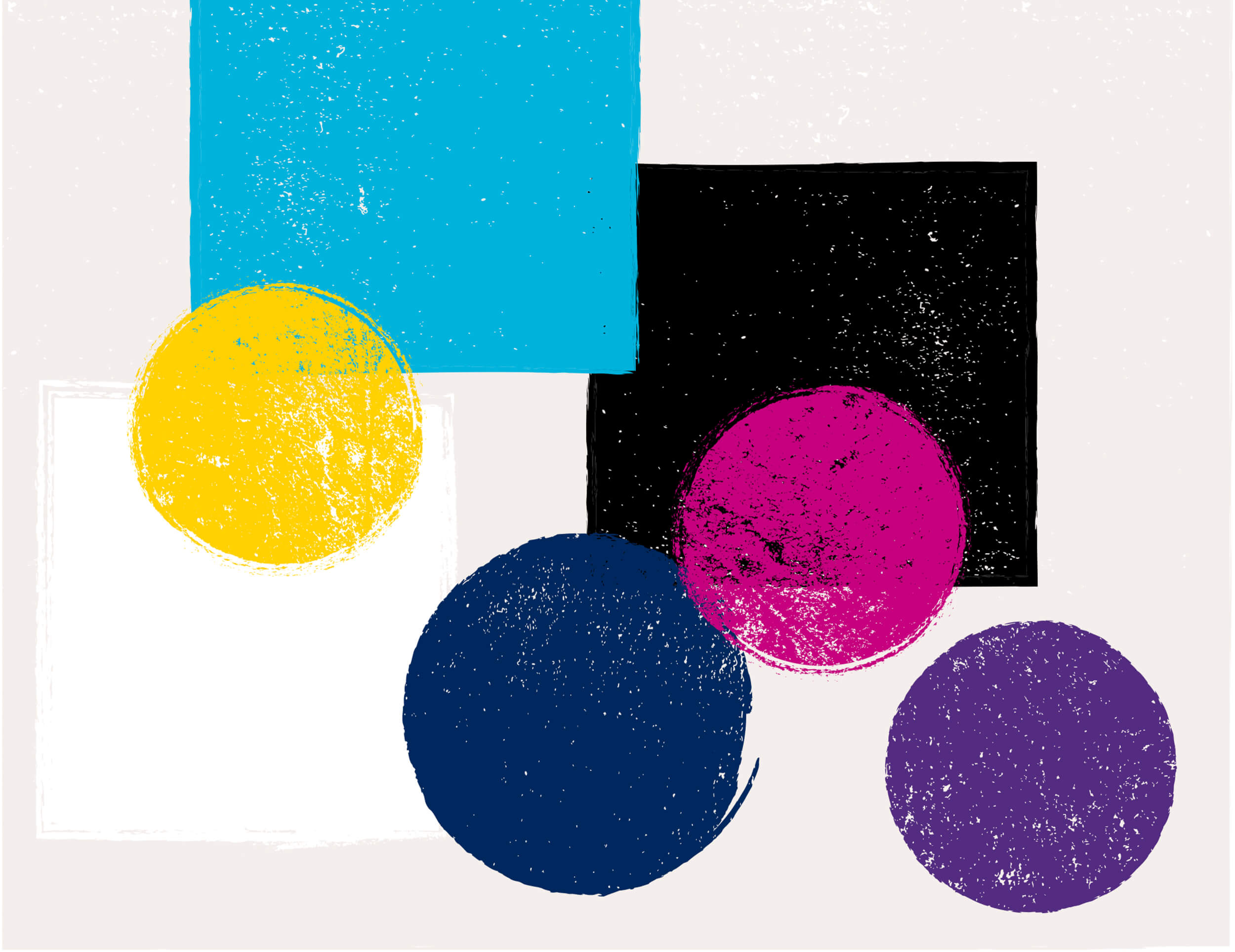
We also added another graphic asset in the form of a library of textures which could be applied in the new palette. These gritty textures helped carry the brand adding a personality and expression that helped to provide a ‘less clean and clinical feel’. These textures help to lift, divide and house information as well as creating a warmer background.
Strategic narrative alignment
Throughout the refresh, we ensured every element aligned with Freedom from Torture’s new strategic narrative. The visual language needed to authentically support how they talk about their work and the people they serve.
Enhanced brand guidelines
Based on six years of feedback from internal teams, we expanded the guidelines significantly. We built in practical checklists and clearer implementation guidance, giving staff and departments the confidence to apply the brand consistently.
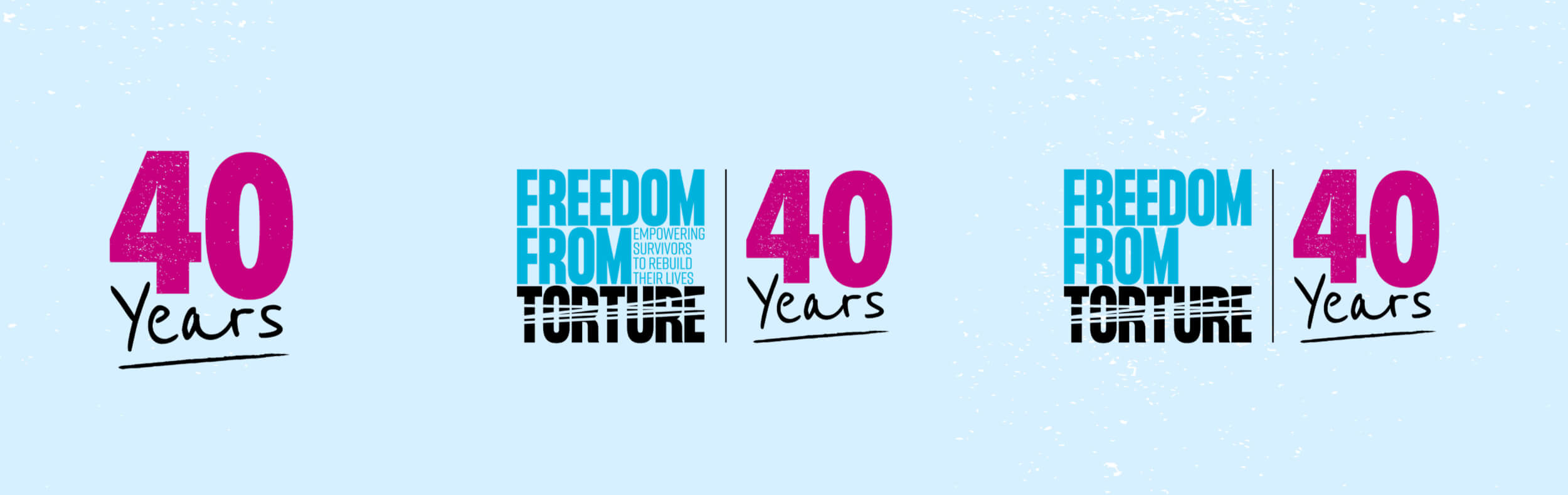
40th Anniversary identity
During the refresh, we also developed a celebratory 40th Anniversary logo. The bold 40 YEARS lockup can be used alongside the main logo, with the strapline, or stand alone – offering flexibility for this significant milestone whilst utilising the textured visual language from the core brand.
The result
Freedom from Torture now has a refined brand system that’s more flexible, more compassionate, and more authentically aligned with their values. The expanded toolkit gives teams confidence to create compelling communications across advocacy, therapy and support, and fundraising, while maintaining the strong, distinctive brand presence they need.
This refresh demonstrates exactly how we love to work – as trusted long-term partners who understand our clients’ missions deeply, and evolve alongside them as their needs change.
What we delivered
- Brand refresh
- Typography refinement
- Colour palette development
- Brand guidelines update
- Anniversary identity