The brief
The British Homeopathic Association wanted to reposition itself as an organisation in order to communicate its charitable status more effectively.
The BHA is the only UK national homeopathic charity that has been in existence for over 100 years and uses its heritage to defend and promote homeopathy. It is a leader in the sector and is a key reference point for media, government and public in gathering information on homeopathy and the patient perspective. Research showed that they were misunderstood as being a membership organisation and one that provided research and advocacy only. They wanted to reach those predominate providers of healthcare for their family who are generally more open to natural approaches to healthcare. From this research they understood they needed to appeal to a younger audience and provide a brand and name to fit the strategic transformation and convey reassurance and trust.
Our solution
As an organisation which handles sometimes divisive views we worked hard to address and challenge the perceptions, barriers and opportunities to create a brand that defined the organisation succinctly and supported their mission to make sure that homeopathy is available for all.
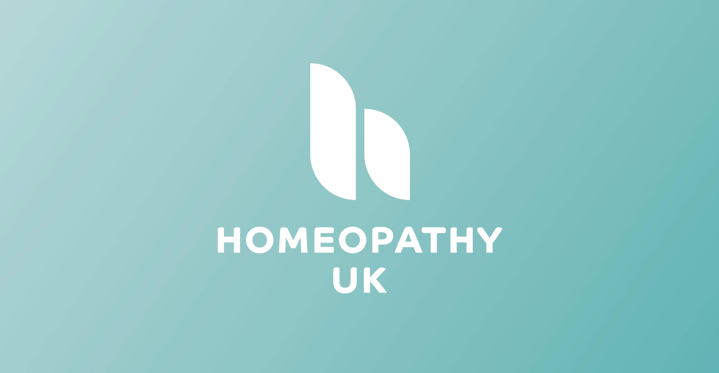
The name change was the cornerstone of the project to move away from the traditional historical name. We wanted to make sure the heart of the organisation was clear and simple and not elevated beyond approachability. After extensive research, consultation and testing the name Homeopathy UK provided a platform that enabled us deliver a modern brand positioning that supported the organisation as a national charity whilst retaining the status of the UK public’s trusted provider of information about homeopathy.
We created a brand identity that had a soft, approachable and natural feel, developing a lower case h from two combined smooth carved shapes symbolising caring and health. Partnering this with a bold modern typeface set in caps to demonstrate the strength of the established history, foundation and earned reputation.
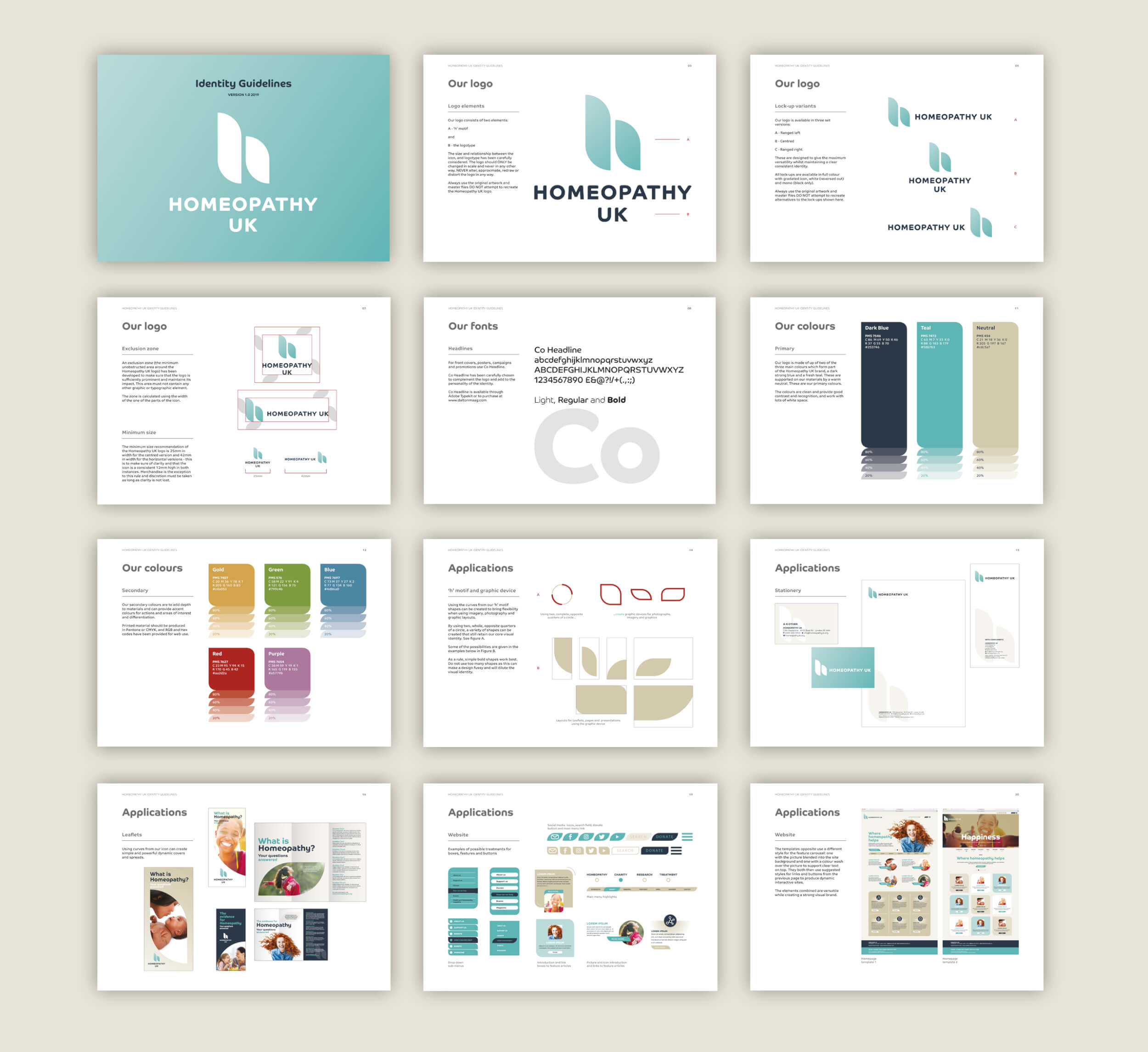
Developing the branding through key materials and assets we also provided a set of brand guidelines alongside the brand toolkit for the inhouse team to roll out through communications and website which was being built by another team.
The services we delivered for the brand repositioning included:
- Naming development
- Brand strategy
- Identity concepts
- Support presenting to board and trustees
- Brand development
- Brand guidelines
- Brand toolkit

The team at Door 22 took our vision and values and worked with us to create a visual identity that was unique and manifested all aspects of our brief and embraced our aspirations. The iterative process was a positive and inclusive experience, enabling us to have confidence changing our charity’s name and visual identity after 100 years.
Cristal Skaling-Klopstock - Homeopathy UK CEO