What we delivered:
- Strategic brand development
- Visual identity design
- Strapline development
- Brand guidelines
- Brand asset toolkit
- Implementation support
- Campaign concepts
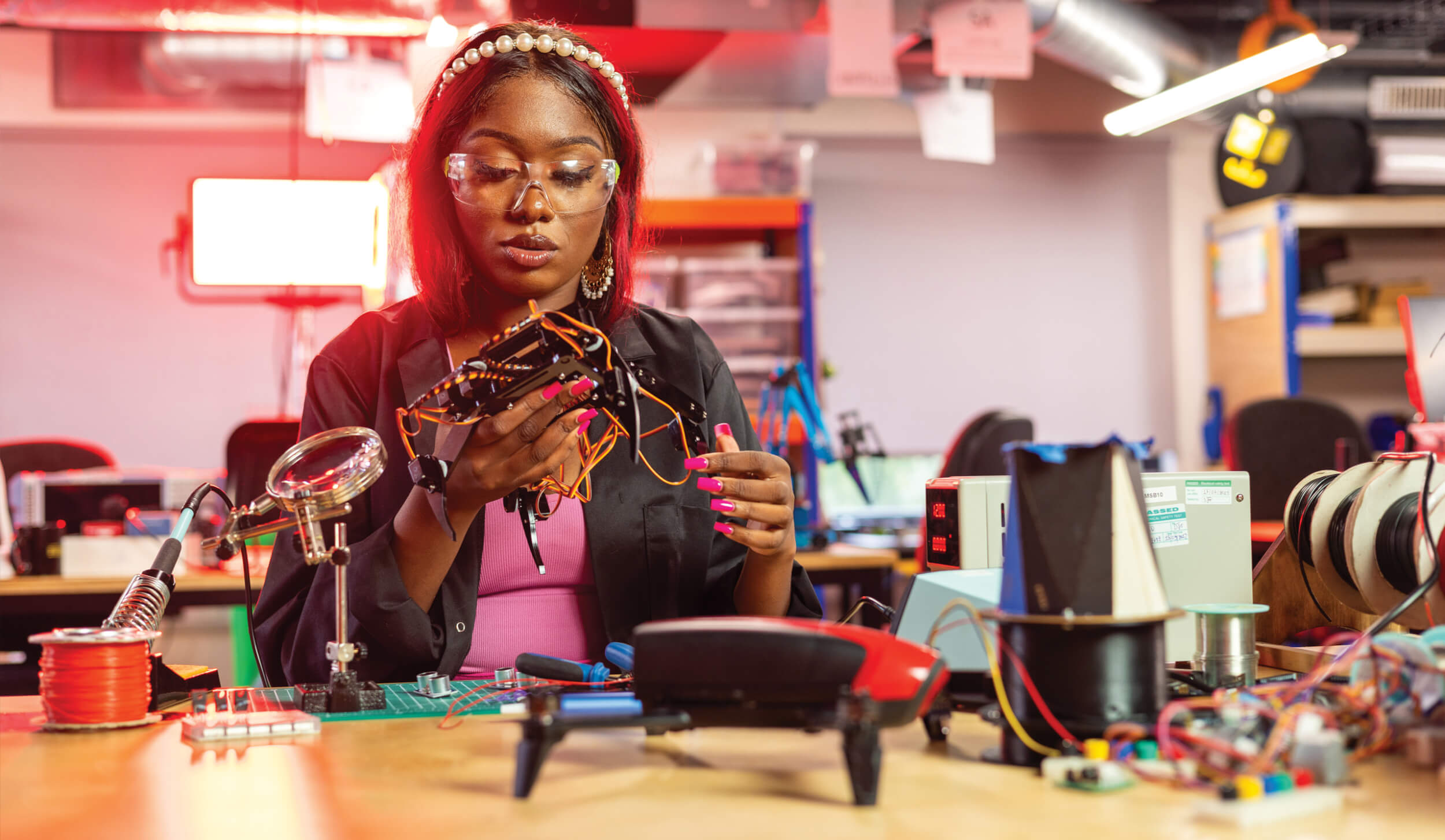
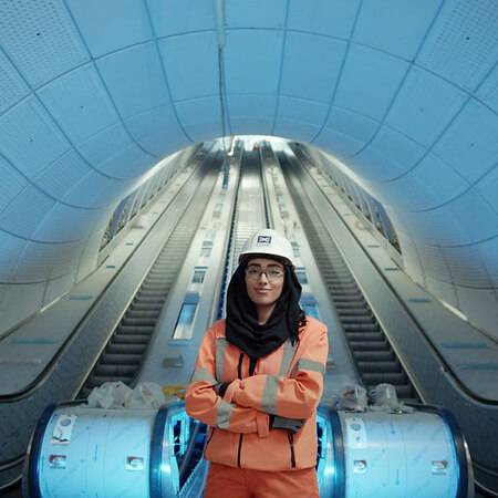
EngineeringUK is a not-for-profit working to inform and inspire more young people – especially those from underrepresented backgrounds – to consider careers in engineering and technology. Their work supports national goals around sustainability, net zero and inclusive growth.
The organisation’s brand framework is complex and includes a number of brands and sub-brands used to communicate with a wide-ranging audience from schools and young people, to the engineering sector.
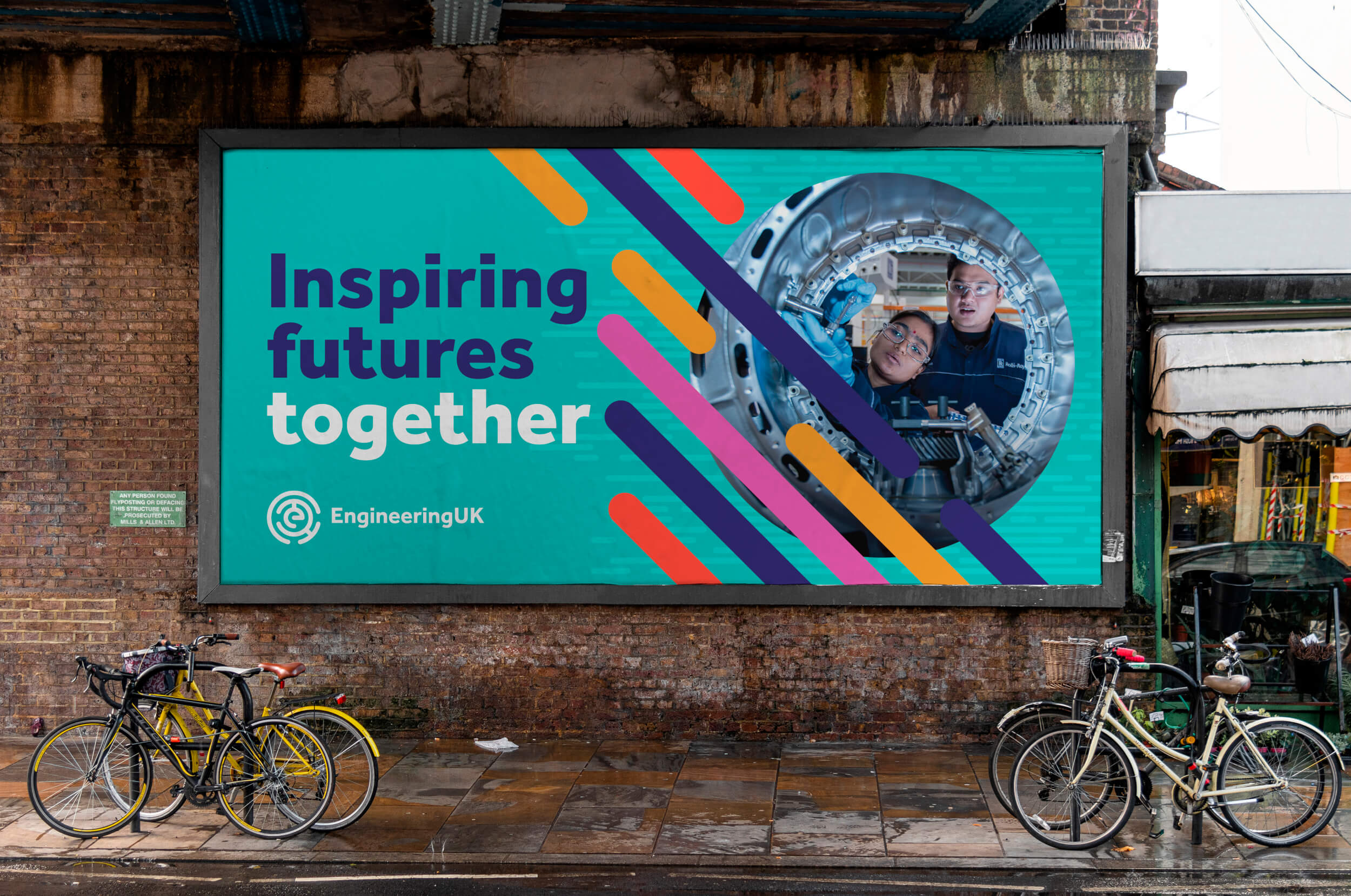
This brand development focused on the EngineeringUK visual identity, aimed at the corporate engineering community. The name didn’t fully reflect everything they do – they’re about inspiring and enabling young people to go into engineering and technology careers. The team wanted us to explore a strapline to support the wider positioning – while remaining recognisable to long-term stakeholders.

We looked into creating a strong concept that encapsulates the essence of engineering and tech, all disciplines of which require the skill of problem-solving. The brand development was based on the concept of a puzzle.
The mark is a shape that suggests both a maze, and biometric style fingerprint with a lower case ‘e’ at it’s heart. The maze represents problem-solving, whilst the fingerprint shows individuality, trust and authenticity.
The puzzle mark underpins the framework, which describes the organisation as curious, knowledgeable and informative. Formed in a roundel, it creates an approachable yet confident mark that balances with an understated sans serif font.

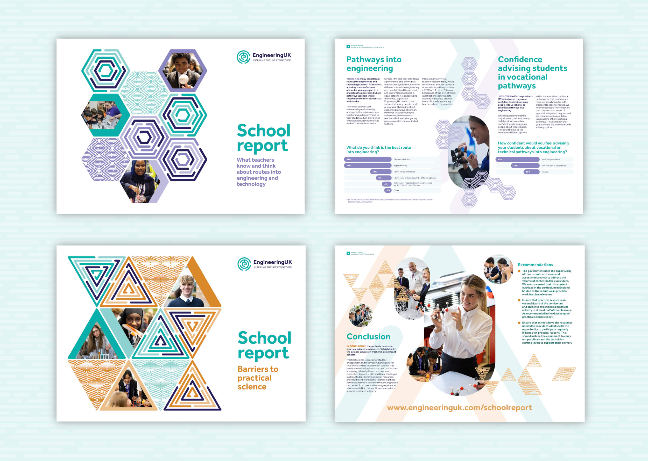
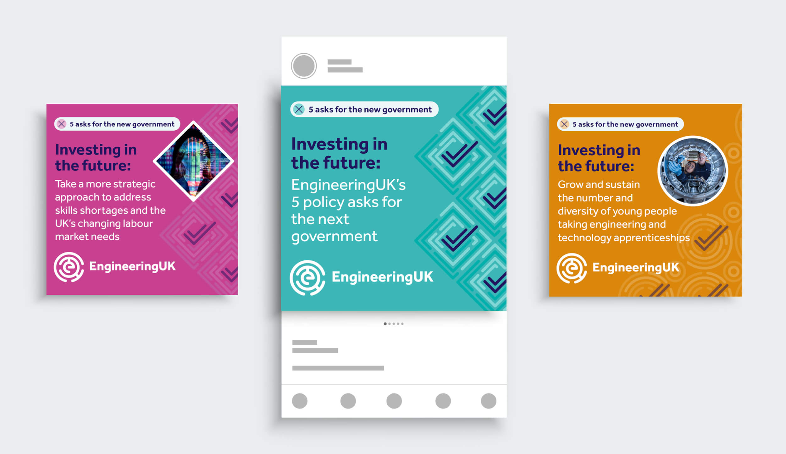
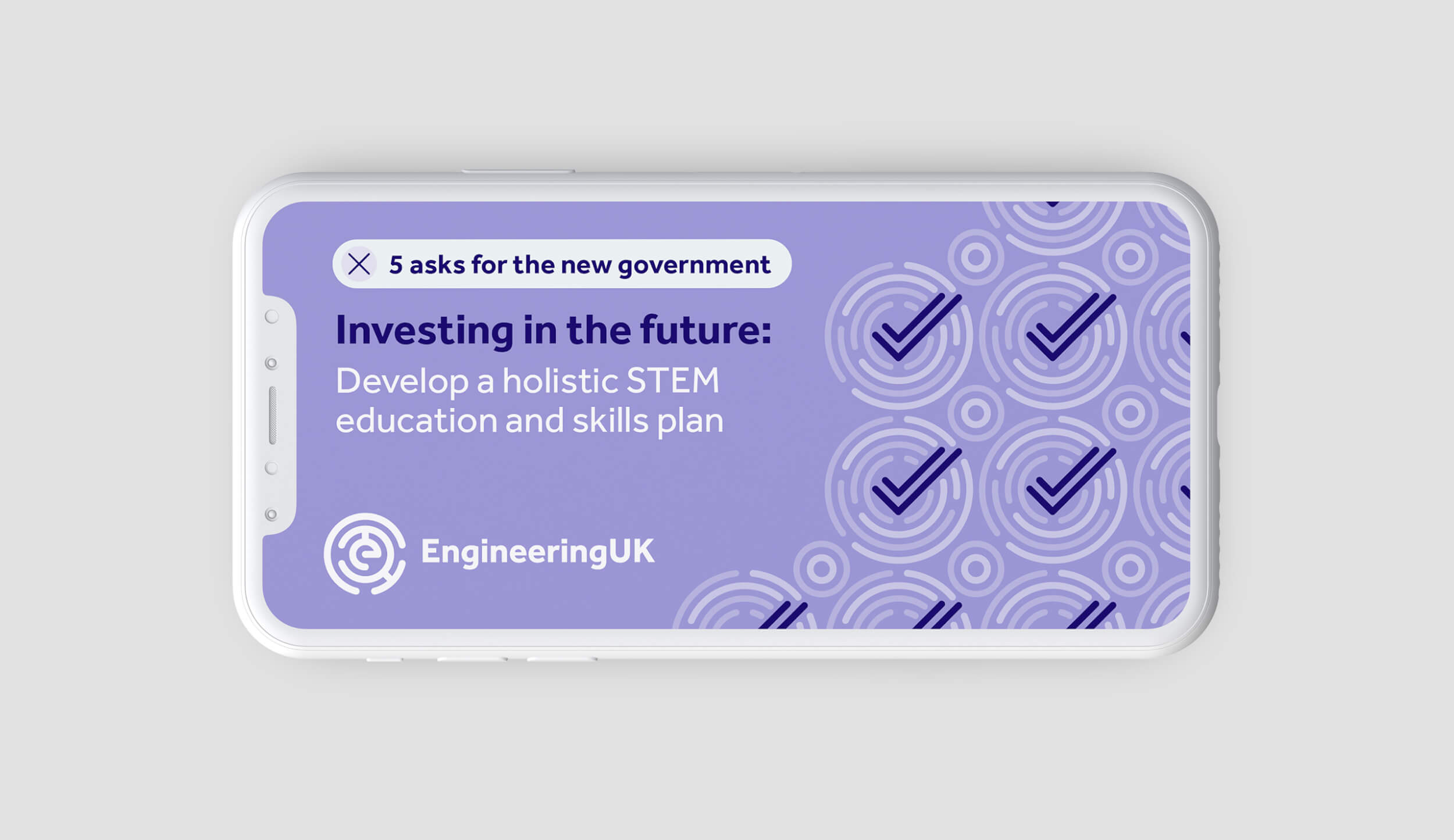
We developed a broad visual toolkit by creating a set of brand assets comprising puzzles and patterns that become flexible devices for brand application. A strong and vibrant colour palette demonstrated diversity and innovation, and provided a contemporary personality. The puzzles can be used individually or combined into a pattern, demonstrating the individual skill required to be an engineer alongside the collective results when teams and individuals come together.

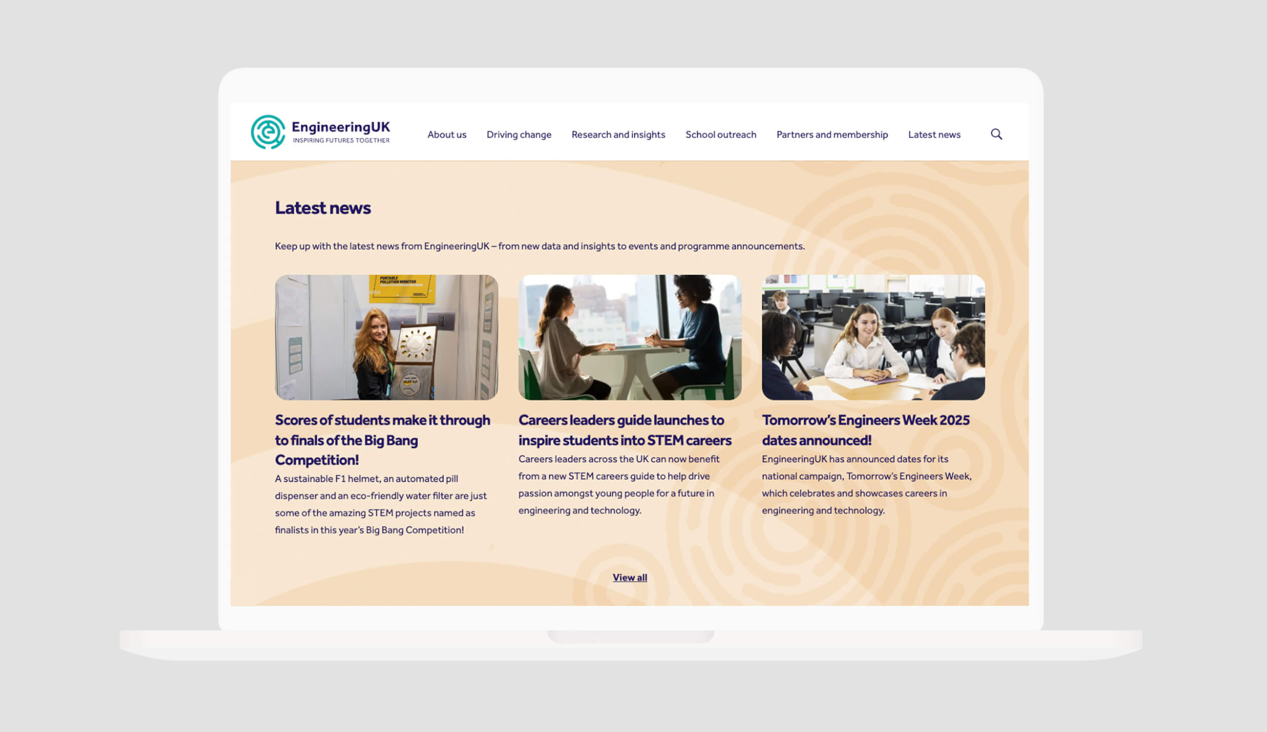
The refreshed brand helped reposition EngineeringUK as a confident, approachable and forward-looking organisation – while staying grounded in their strategic priorities. The identity is now used across a wide range of materials, from schools engagement to sector advocacy, and continues to support their mission of reaching more young people from more diverse backgrounds.
—
Image credits: © Rolls-Royce PLC and © ThisIsEngineering
We really liked your approach to the brief, from the questions you asked to the process you outlined. You cut through much of the ‘fluff’ we see from other agencies and gave us the confidence we’d be working as a team on something we could all be proud of - not just as client and supplier. Your experience and creativity works hard for us. You’re incredibly supportive and patient, offering ideas and improvements that added real value and aligned with our aims. You’re wonderful to work with - creative, friendly and efficient.
Tamzin Caffrey, Head of Communications, EngineeringUK