January 26 2021
Tags:
Share:
Here we are with part two in our three-part series on Accessible Design. Part one looked at how to make colours accessible, especially for those with Colour Vision Deficiency (CVD). In this second instalment, we will look at fonts and how making the right choices in designs will mean the material is accessible to a larger audience.
Accessibility to fonts is something that differs between many groups of society, including those with visual impairments, learning difficulties, aphasia and dyslexia. What one person can scan through quickly and understand can be completely inaccessible for another. Choosing the correct font can be the difference between the success and failure of design.
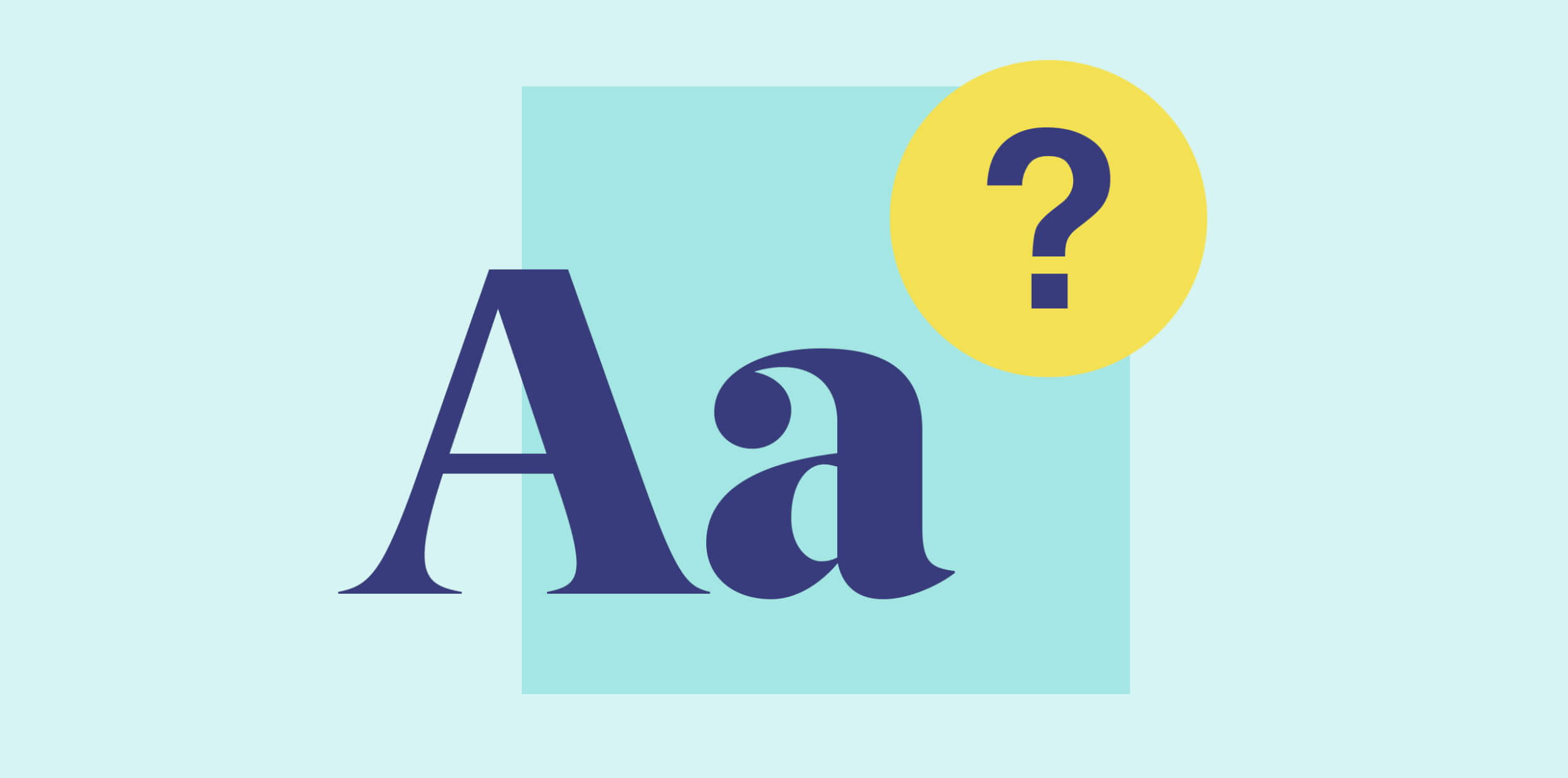
How do we choose fonts?
When choosing an accessible font, there is so much more to consider than what looks good. Other factors include size, colour, justification, letter spacing (kerning), word spacing, line spacing (leading) and weight. That’s quite a list.
As a general rule, it’s important to choose a font that has clarity, good proportions and clear character recognition. There are some very creative fonts with really illustrative and playful qualities – but, for accessibility purposes, these should generally be avoided.
Let’s look at 10 tips for choosing accessible fonts…
- Evaluate serif versus sans serif – serif fonts have extra strokes and tapers (‘twiddly bits’) on the letters, whereas san serifs don’t – compare: ‘flight’ (serif) and ‘flight’ (sans serif). The general conclusion is that sans serif is better than serifs because they are considered less distracting and more like written text. However, this is not a hard and fast rule, and people with dyslexia can still experience challenges reading sans serif.
- Don’t use blocks of capital letters – excessive use of caps is very difficult to read. Use different font weights and bold to emphasise or pull out information instead.
- Select weights carefully – be sparing in the different weights you use, sticking to a maximum of two to avoid confusion. Also, although light weights are very minimal and stylish, they can be incredibly thin and produce poor contrast. Consider using regular and medium weights as a minimum, certainly for body text.
- Think about size – as a general rule, use a minimum of 12pt for accessibility – if possible, choose 14pt. For the visually impaired, it’s usually advised to prepare specific large print versions where font size is 18pt and preferably in a sans serif font like Helvetica.
- Look at alignment – align large areas of body copy to the left. Small areas of text and headings can be centralised but never right align or justify text. Justified text can create some very odd and confusing word spacing.
- Consider identical letters – many fonts have identical letters, which can make reading really difficult. For example, the word ‘ill’ appears as three straight lines in many fonts when starting with a capital: ‘Ill’. In other fonts, however, there is a clear difference – see the example below.
- Avoid letter mirroring – one challenge for people with dyslexia is when letters invert themselves. Therefore, if a ‘b’ is the exact mirror version of a ‘d’, then this can make a text difficult to read. The same goes for letters such as ‘p’ and ‘q’. An accessible font will differentiate between these letters by using asymmetrical design.
- Choose single-storey letters – double-storey letters like ‘a’ usually facilitate reading at a higher speed. However, given that they don’t look like the letters we write, they are actually harder to process for some people than single-storey letters like ‘a’.
- Avoid italics and underlining – these can make text look too crowded, and using italics actually changes the shape of the letters, increasing difficulties.
- Increase line and letter spacing – officially known as ‘leading’ and ‘kerning’ respectively, spacing should be increased to make design more accessible. The ‘busier’ a design is, the harder it is to process.
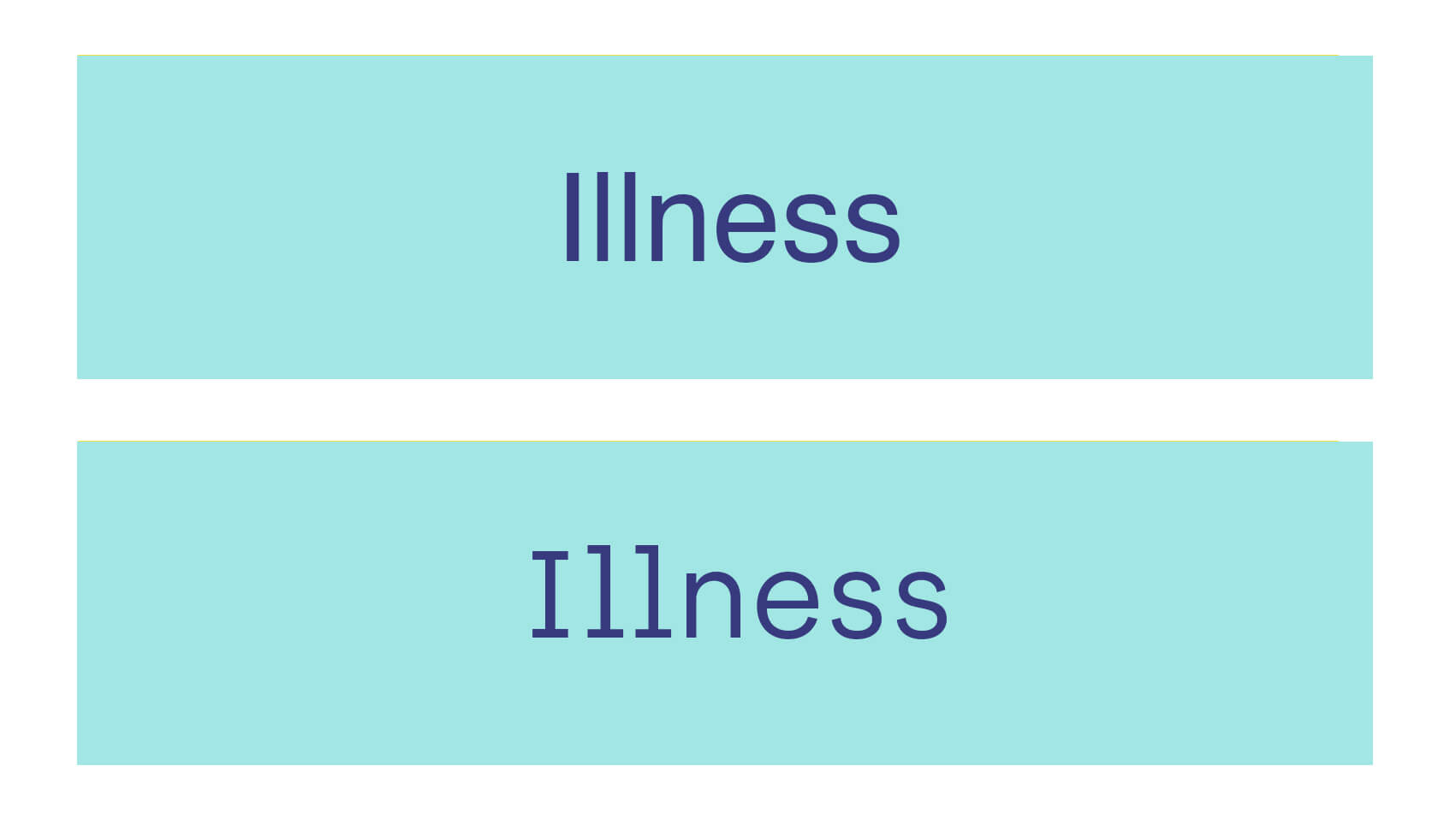
Consider identical letters – many fonts have identical letters, which can make reading really difficult.
Which fonts are more accessible?
So which fonts can you choose to make design more accessible? We can’t ignore the often scoffed at font: Comic Sans. We’d go as far as to say it’s been downright ridiculed in the design community. But, it actually ticks many of the boxes for accessibility. Its asymmetrical lines and irregular letter forms make each character unique, which avoids letter mirroring. It also differentiates well between characters, making words like ‘Illness’ easier to read.
A downfall of Comic Sans is that it’s seen as childlike. But there are other typefaces and fonts, such as FS Me, that offer good character recognition and differentiation. And some fonts have actually been developed especially for the dyslexic community – Dyslexie, for example, was created by a graphic designer who is dyslexic himself. A fuller list of preferred fonts for dyslexia has been put together by the British Dyslexia Association: Typefaces for Dyslexia.
At Door 22, we enjoy the creativity of thinking about accessibility when it comes to the fonts we use. As with the colour choices we evaluated in part one of this series, best practices that help certain groups of society also benefit everyone, making our designs more inclusive – and this is very important to us. But rather than following prescriptive official guidelines that can be limiting, we like to use the knowledge of what makes a font accessible, together with the flexibility of design, to choose from a variety of fonts. This way, we identify which will suit the purpose best, ensuring not only accessibility but also maximum effect and enjoyment of the material by every reader.
If you’d like to know more about how to choose accessible fonts, then just get in touch. We’d love to chat.