The challenge
Vetlife offers three core services to vets: a helpline, health support and financial support. As part of a wider brand audit, they wanted to refresh an existing event flyer that had been used for several years. The brief called for a new design that would catch attention in a busy event environment while staying true to the brand. The flyer needed to clearly communicate what Vetlife does, and how to get in touch.

Our approach
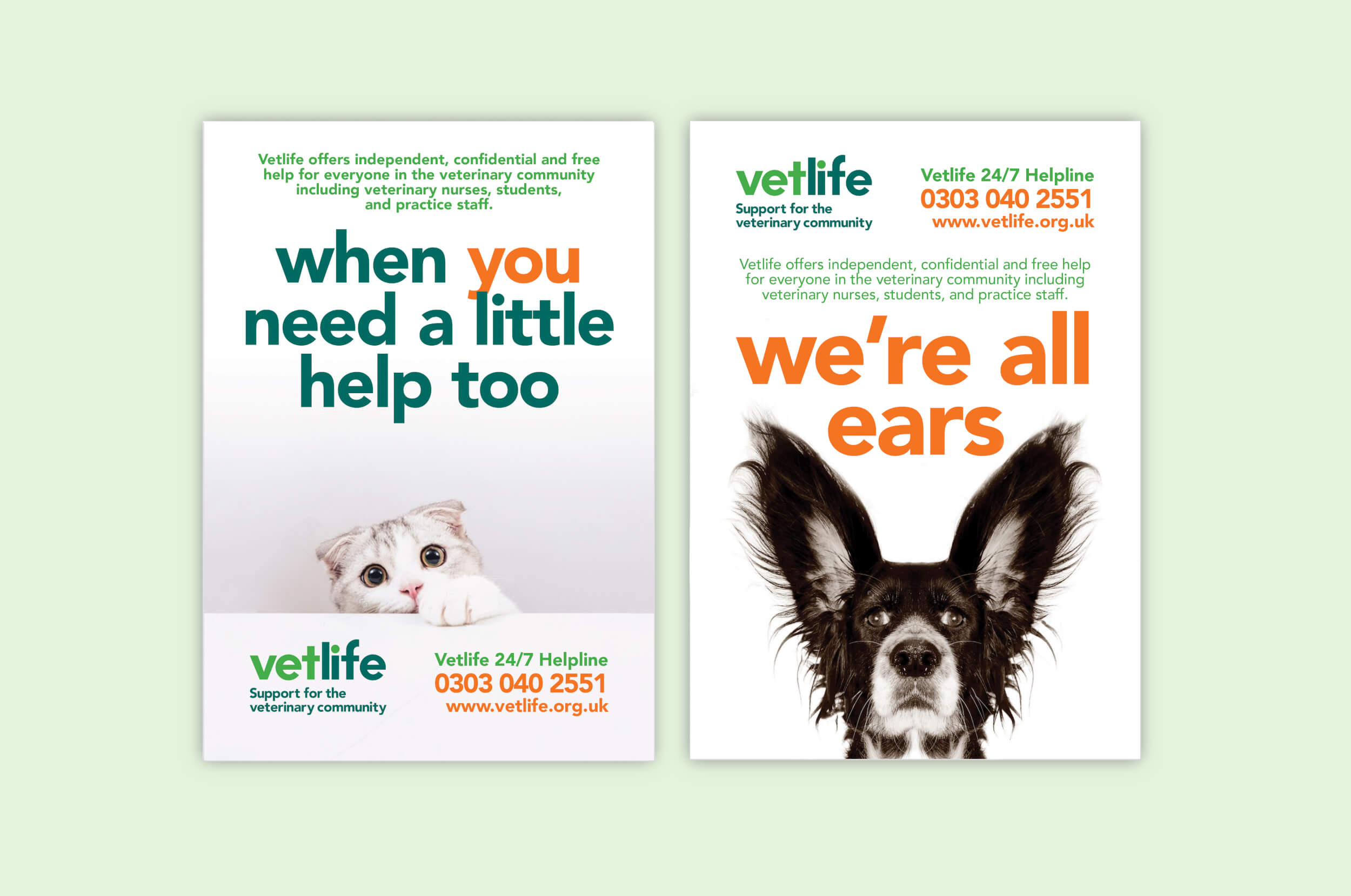
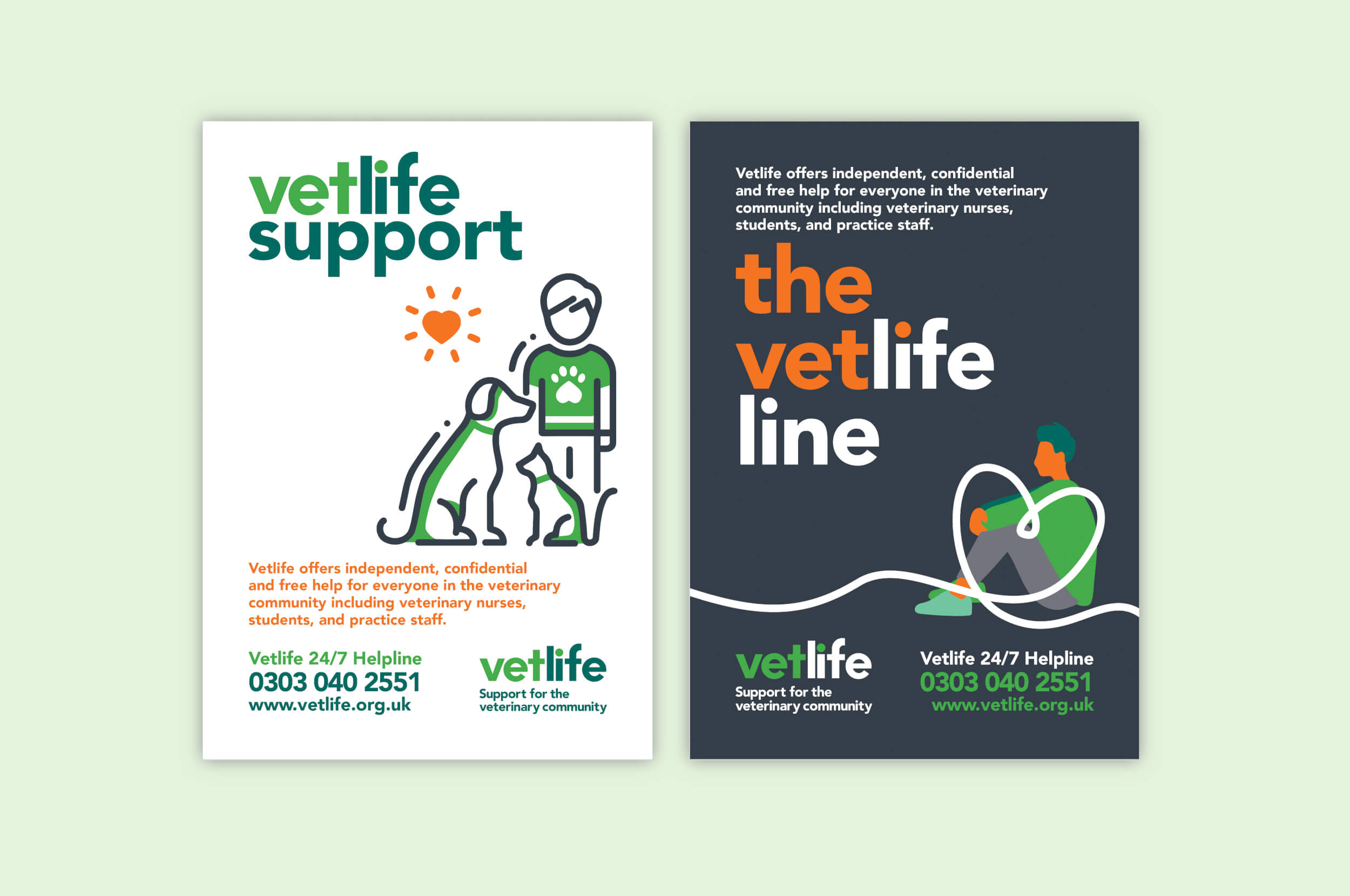
At the concept stage we always explore different approaches, from more conventional through to bolder options. We developed two creative routes to present to Vetlife, both rooted in the organisation’s established brand but offering different ways to connect with its audience.
One concept took a bold, conversational approach. Using animals to represent empathy and the vet–client relationship, it played with gentle humour to create an instant reaction and spark curiosity. With a clean white background and the Vetlife palette, the visuals and call to actions stood out clearly, which was ideal for a busy event space.
The second route evolved the existing design, building on the familiar look and feel with refined layout, stronger hierarchy and refreshed typography to give a more contemporary but recognisable style.

What we delivered
- Two design concepts, presented with rationale and visual mock-ups
- Copy refinement and layout development
- Print-ready artwork for the final chosen route

The result
By presenting multiple creative directions, we gave Vetlife a clear view of what was possible – from a fresh take on their established design, through to a concept that pushed creative boundaries. The organisation chose the safer and more familiar route for this campaign, while the alternative concept was bolder, opened up conversations about how the brand might evolve in future communications and, in our opinion, addressed the brief of catching attention at a busy event.
