April 15 2021
Tags:
Share:
This is the third blog in the series of our accessibility posts. Accessible design or as we prefer to call it, inclusive design, should be considered as a base for every project and should start with a common-sense approach.
It is often seen as complicated and perhaps a bit dull, but it’s actually an incredibly important and interesting part of the brief. We don’t see accessibility as a barrier to creating good design, but as a way to allow more people to engage with excellent design: creating communication materials that are a positive experience and quite simply, reach more people.
Why is inclusive design so important?
Inclusive design principles are applicable to everyone of course and not just those with defined or diagnosed access needs. Everyone can benefit from considered design, layout and visual structure. The reason inclusive design is so important is that there are areas of visual reaction and stimulation that can be a barrier and create uncomfortable sensory experiences. A small design adjustment and understanding can immeasurably improve legibility, clarity and comfort.
Whilst good design principles should naturally include elements such as good colour contrasts and good font selection, layout and basic arrangement of information is key to inclusivity.
These principles help everyone, but in particular yet not exclusively, people on the broad autism spectrum and those with dyslexia. For those with autism, design that is simple and consistent in layout and avoiding bright contrasting colours that may detract or distract is important.
Good guidance for being inclusive for people with dyslexia is to:
- Have a consistent, ordered and clear layout
- Justify text to the left
- Keep content short and avoid large blocks of text
- Don’t use additional styling such as underlining, caps or italics
- Use bold to emphasise
- Use dark grey text. 100% black on a white background can create a blurred effect
Where advice may seem contradictory e.g. using bright contrast for those with low vision, which might not be preferable for some users on the autistic spectrum, testing your designs with users always helps. This allows you to find the right balance and make compromises that best suit users’ needs.
Linear, structured and consistent layout in design is a thing of comfort and pride amongst most designers but when inclusivity is a consideration, it adds another layer of restraint and experience
Top priorities for inclusive design layout:
Linear, structured and consistent layout in design is a thing of comfort and pride amongst most designers but when inclusivity is a consideration, it adds another layer of restraint and experience. Here are some top priorities for design and layout to help make your design as accessible as possible:
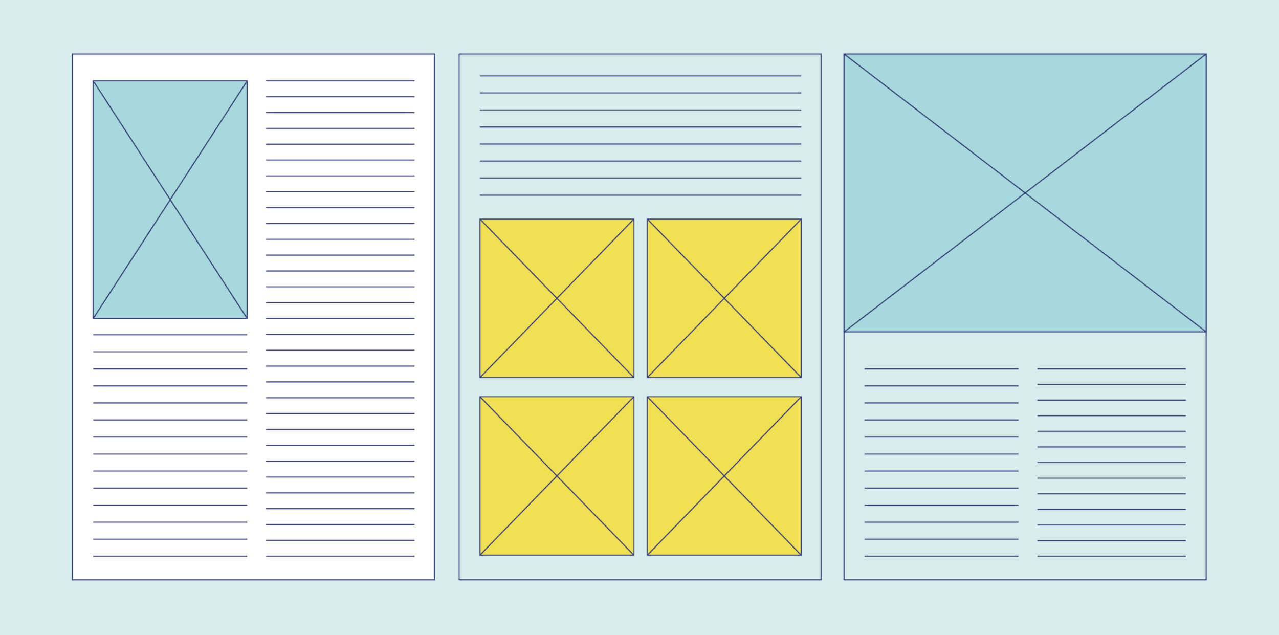
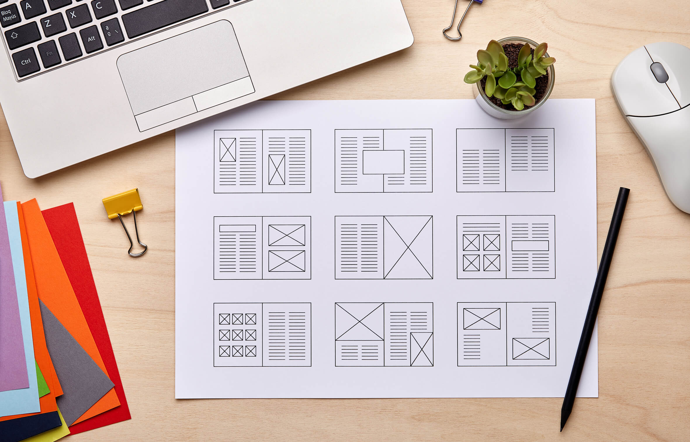
Layout and grid
Use a consistent and simple grid to create structure to the layout. Try to break up large areas of information and avoid big walls of text. Linear layouts are advised where the information is ordered and not scattered around the page. Steer towards a less cluttered design. A good general rule of practice for optimum inclusivity is to not have more than two columns on a page
Content
Use short sentences where possible. Bullet pointed lists can be a good way to break up long sections of information.
Paragraphs should be kept short where possible, with a full line space between sections.
Text on images
Make sure text is legible with good contrast. This might seem obvious, but the general rule is to only place text on top of images if there’s a definite clear area or light background colour. Consider instead placing the text either outside the image, or using a design shape or device to house the information so it’s easier to read.
Tables
Tables can be very complex and daunting at the best of times; not just for the reader but designers too! Tables are a fantastic way to provide heavy statistics and comparative information, but they need not be visually busy. Try not use large tables, instead break them up into smaller separate tables or sets of information.
These are just a few of the main considerations we bear in mind when working for our clients. It’s always worth testing your material to continue to improve the reach and clarity of your information.
As Abi James, chair at the British Dyslexia Association Technology Committee said: “Information is part of our lives – everyone should have access”; so let’s work to make information as visually inspirational as possible for as wide a range of people as possible.
If you’d like to know more about accessible design, then just drop us a line. We’d love to chat.